I made a thing. It’s not a perfect thing, but damnit I’m proud of it. And given the circumstances, I’m pretty sure it’s the best damn thing I could have possibly made.
I made a book.
I didn’t write the book, but I did format it. I drew all the illustrations. I sewed it. I glued it. I made the physical book itself. It sapped what sanity I had left in me at the end of semester and it took two nights of staying up until three in the morning, but I made it.

I made it as the final project for my publishing design technologies class. I had issues with that class from the beginning. Not with the class itself, exactly, but with the lab. There seemed to be no preplanned structure to the way our labs were run. Instruction was minimal at best and at worst it was confused and flat out wrong. The professor and the TA didn’t seem to have discussed how the labs were to be taught, because the TA often seemed at a loss to explain to us how to do the lab assignments the prof gave us. Considering that we were a class of students who mostly had no idea how to work InDesign, it was frustrating to say the least when the prof gave us a lab sheet that says, “do this thing” and when we ask how to do the thing, the TA says, “Don’t worry about that thing” and then, naturally, we got points taken off. After a month of that I figured that Google was probably going to be the best instructor I could get to pass that class, and I stopped asking the TA to do the thing she was getting paid to do.
This final project was no different. We received minimal guidance on how to get the book printed and were instructed to watch Sea Lemon videos to learn how to put the book together. In fact, the only part of this that I was decently confident about was the formatting part. I’m by no means an expert on InDesign now, but I feel confident in my ability to format raw text at least from this class. Illustrator and Photo Shop remain beyond my skill level. None of that would have been that big of a deal except, like I said, this was my final project. It came at the end of semester when I also had two essays and two final exams to complete/study for. And the final project was worth 22% of my grade. So I was in full on panic-stress mode for two weeks racing my deadlines while my professors and TAs were on the sidelines telling me to calm down and not freak out. Which is a bit like being on the bomb squad trying to dismantle a nuke on a sixty second timer with the whole city standing around telling you that it’d be okay if you took a coffee break. Or at least that’s how it felt at the time. And since the TA had already made me nervous about asking for any kind of help due to her insufficient knowledge, I felt completely on my own in this.
But this post is about the book, not the class, so I’m going to walk you through the step-by-step process as best I can. To be honest though, I think I’ve locked up some of these memories for my own mental health, so there may be some gaps.
We were given a raw text file for Alice’s Adventures in Wonderland by Lewis Carroll, but it had terrible line breaks throughout the whole thing that I didn’t have time to go in and fix by myself, so I grabbed the text off the internet instead. Formatting in InDesign is an incredibly laborious process. It’s not at all like Word, so don’t complain about what your formatter charges you. It’s a pain in the ass that involves making different character styles, paragraph styles, and master pages for each different formatting element in the document. Alice is only twelve chapters long, but it took me four days just to format the raw text. Including putting in the images, doing the line edits, correcting for widows and orphans and the final proof read, I read that damn book, cover to cover, six times. That was before any printing at all had been done. (To extrapolate, the idea that ebooks require no extra work than physical books and therefore shouldn’t cost so much is wrong. It’s so wrong. Stop disseminating this idea.)
The formatting, as I said, was the easy part. After I had it formatted, I had to figure out how to print it. I ran into some problems here. The first problem was that I wanted it printed on high quality, textured cream paper. It’s just a style choice for me. I don’t like white paper because the ink contrast is too high and it hurts my eyes. I also think that it looks cheap and unprofessional, but again, that’s just me. The problem was, if I wanted that kind of paper I’d have to buy it and print it myself, because ordinary print shops don’t carry high quality textured cream paper, and they don’t let you bring in your pwn paper either. But this presented its own problem because, as I discovered the night before my very last lab in which to work on this project, my printer doesn’t print double sided. So I had to scrap that idea.
The second printing problem that I had was signatures. Signatures are packets of four to five sheets of paper representing sixteen to twenty pages when folded in half. In traditional bookbinding (ie the kind of book binding you’re probably most familiar with) signatures are sewn together to create a uniform shape for all the pages in the book. But it involves a complicated formatting arrangement of the pages that we were assured by prof and TA both that the printers would understand how to do. I was assured by prof and TA both when I asked multiple times that if I went to the printer with my regularly formatted PDF file and said, “I want this printed in signatures of five sheets each” the printer would understand and would be able to print it how I wanted it.
This was not the case. The first printer I went to had no idea what I wanted. He didn’t know what a signature was, and when I explained to him what it was, he printed the whole document in one giant signature. Imagine taking thirty-five sheets of paper and folding them all in half. It doesn’t make a nice, uniform edge, does it? Not only that, but the sheets didn’t print in the correct order, so it was a complete waste of time, and it put me in a full on freak-out, because I had to go to work that afternoon and if I couldn’t get my signatures printed that morning I wasn’t going to have time to print them ever. The TA’s advice was to print a sample sheet myself, but I didn’t know how to do that at all, and she wasn’t much help explaining it to me, so I contacted every printer within walking distance to get a price and a time quote on this project. Thankfully, DigiTech Printing, less than five minutes from my school, figured they could get it done before noon. So I hauled ass over there with my files and, I have to say, they were the nicest, most accommodating people I worked with through this whole ordeal. Their professionalism, knowledge, and willingness to work on a deadline brought me down from apoplectic panic to mild worry. They assured me that everything I wanted (aside from the high quality, textured cream paper) could be done, but there was only one, small problem: price.
Wearily I asked them how much. They said $80. I said done. They reasserted that it would cost me $80. I said I didn’t care how much it cost as long as I didn’t have to be the one to deal with it anymore. I’m not ashamed to say that I literally threw money at the problem until it went away. The important thing was that I had my signatures printed, folded and trimmed, and all I had to do now was bind the book, which I didn’t need my prof or my TA for, since I would be learning that part via YouTube videos. (Why did I spend $1000 to learn publishing design from Google and YouTube?!)

Of course I needed the materials for bookbinding. Those I had to buy from Opus, Dessew, and Michael’s which are thankfully just down the street from my school. They were unfortunately far less knowledgeable, professional and agreeable than DigiTech. Dessew seemed to be staffed by grannies who are altogether tired of your shit. With the exception of the one lady who helped me find the black canvas for my cover, everyone else I dealt with in that store treated me like a junkie asking to use the bathroom. (Though to be fair I’m pretty sure all the shopkeeps on East Hastings have to deal with more than their fair share of junkies on a regular basis.) Opus on the other hand seemed to be staffed entirely by stoners who thought it would be great to operate an art supply store until the high wore off and they realized they had no fucking idea what they were doing there. No one seemed to know where anything was in the store. I was passed off to four different employees who kept scattering like scared rats at the sight of a customer. My efforts to explain what I was looking for turned up the most useless products for my project (giant sheets of paper that no one would cut, when I only needed a couple 8″x11″s) and endless chatter about anything but the products I was looking for. My last stop was Michael’s which looked like the Grinch had ransacked it. He took the cloth-binders, paper-punchers, and ink-dabbers. He took the wax thread, the gold letters, the red ribbons. What bits of glitter he left behind in that store were barely enough for a mouse and no more. Lesson learned: don’t go to Michael’s before Christmas.
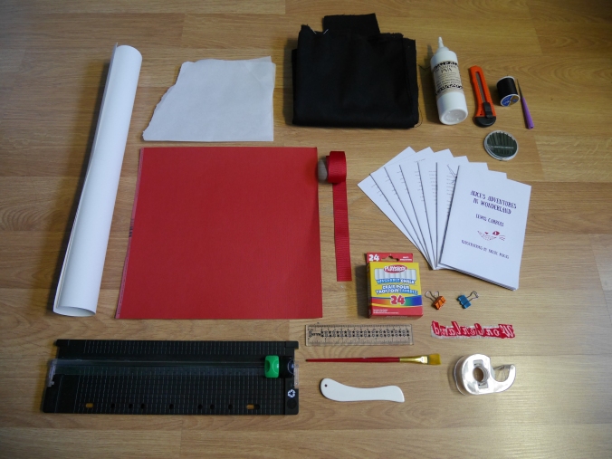
So there I had all my supplies. All I had to do was: sew the signatures, glue the signatures, trim the pages, cut the cover boards, measure the cloth cover, make the headband, position the lettering, make a text block, glue the headband to the text block, glue the text block to the end sheets, glue the end sheets to the cover and FINISHED!
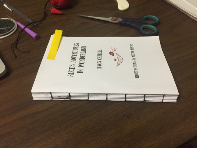
Easier said than done. The sewing of the signatures actually turned out to be fairly easy, despite me doing it completely wrong the first time and having to cut and unthread the whole thing and start from the beginning. I was actually quite pleased with how the corrected version turned out.
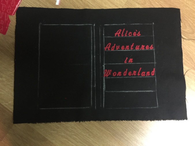
I applied two coats of bookbinding glue to the sewn spine and let it dry overnight while I worked on the cover. The cover was trickier. As with every step of this damn project, there was a problem. In this case, I ran out of time to make a dust jacket, in part because I was busy completing other assignments, and in part because the printing of the signatures took way, way more time than I anticipated it would for reasons outlined above. So I had to put the title directly on the cloth itself, and the only way I could think to do that in a professional looking way was with iron-on letters. These came in large sheets from which each individual letter had to be cut in squares. The squares then had to be placed down on the cloth and ironed on both sides, which meant that I couldn’t glue the cover boards to the cloth until after I had ironed on the letters. This posed the challenge of how to position the letters so that they would appear evenly on the final cover. I solved this in the messiest way possible: I outlined in chalk. In hindsight this was probably not the best idea. Honestly, a piece of yarn rolled in flour probably would have been neater, but I was fueled entirely by coffee and cortisol as I was working on this portion, so I wasn’t exactly thinking clearly. I sketched out the position of the book boards, and where I wanted the letters to be which left only one complication: how to line up the individual squares of letters so that they would look neat and not move under the iron? My solution: make a type block out of scotch tape. I positioned each letter upside down and backwards as neatly as I could muster on a strip of tape and then taped the sucker down on the chalk line I drew for it. I could then iron the letters, front and back without worrying about them shifting out of place as I did so. The result was less than perfect, but better than expected.
It took a course paint brush to scrub away most of the chalk lines. I wasn’t exactly happy with the lines that remained, but definitely too exhausted to care overly much about it. Gluing everything together also turned out to be relatively easy, starting with the text block which took a couple of extra sheets to make it cohesive, and then the end sheets, which would attach it to the finished cover. For whatever reason the edges of the pages ended up slightly uneven at this stage, so I had to cut them with a craft knife. Despite my best efforts, however, the knife kept slipping and I was left with an uneven cut. Sea Lemon recommended taking a file to the uneven edges to make them smooth which yielded… mixed results which I won’t picture here.
The final complication ended up being a few pieces of information that, if left missing, would result in at least a letter grade deduction. These were, ISBN, publisher information, and the back blurb. As already mentioned, I didn’t have time to do a dusk jacket, so I was going to print an obi (book belt) to fit around the back cover instead, except my easily confused printer couldn’t figure out what size paper I wanted, so I had to go with something much smaller and much more slapped together. In the end, the final product looked like this:


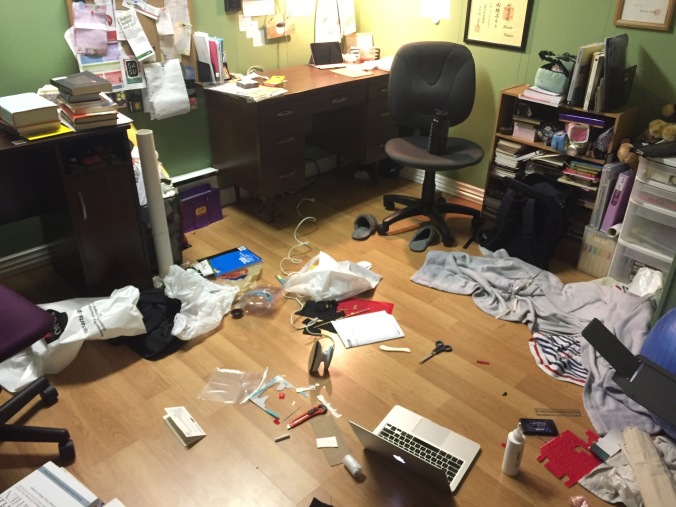
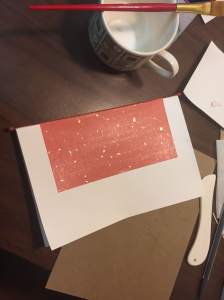
I don’t know what I got on the project. I won’t know until I get it back in January. If my final grade is anything to go by I got less than an A on it, which I’m extremely disappointed by given the amount of effort I put into this compared to the amount and quality of instruction. I ended up finishing the course with an A- however, so I don’t have much footing on which to complain. If there are any constructive criticisms on the project when I get it back, I’ll edit them in here. What I do have are the memories, and the first hand knowledge of what an all nighter looks like. For the record, it looks like this: